
Sketching Fundamentals: Getting Started with Pencil and Paper
Master the basics of pencil control, shading, and composition to build a strong foundation in drawing.
Why Pencil Drawing Matters
There's something special about putting pencil to paper. You're not worried about colors mixing wrong or paint drying too fast. It's just you, your pencil, and the blank page. Sketching is where most artists start — and honestly, it's where the magic happens.
Whether you're drawing for relaxation, building skills for a career, or just exploring something new, understanding pencil fundamentals changes everything. You'll develop muscle memory for consistent lines, learn how different pencil grades create different effects, and discover that shading isn't mysterious — it's just controlled pressure and patience.
Understanding Pencil Grades and Selection
Not all pencils are created equal. You've probably seen pencils labeled with numbers and letters — HB, 2B, 4B, 2H — and wondered what they actually mean.
The H stands for hardness, the B for blackness. An HB pencil is middle ground — it's what you probably used in school. As you move toward H (like 2H, 4H), pencils get harder and lighter. Moving toward B (2B, 4B, 6B) means darker, softer marks. For beginners, an HB and a 2B are honestly all you need to start. The HB gives you precision for outlines, the 2B lets you build darker shades.
Quality matters more than quantity. A decent mid-range pencil will serve you far better than a huge set of cheap ones. You're looking for pencils that sharpen cleanly without the lead breaking, that don't skip when you're drawing, and that actually feel good in your hand.
Quick Pencil Guide
- HB: Balanced, good for outlines and detail work
- 2B: Soft enough for shading, dark enough to see clearly
- 4B or 6B: For deep shadows and dramatic contrast
- 2H: Light lines, useful for preliminary sketches you'll erase


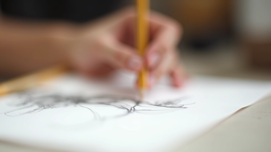
Pencil Grip and Hand Control
How you hold your pencil determines everything. Most people grip too tightly, which exhausts your hand and limits your control. You'll see artists working for hours without fatigue — that's because they've learned to hold with intention, not tension.
For detail work and precise lines, hold the pencil about an inch from the tip, using your thumb and first two fingers. Keep your grip relaxed. For shading and broader strokes, move your grip further back — almost halfway up the pencil. This naturally gives you less control but more freedom for gestural marks.
Your wrist should be flexible, not locked. Most of the movement comes from your forearm and shoulder, not your fingers. When you're shading, you're moving your whole arm, not just wiggling your fingers. This is how you get smooth, consistent tones instead of scratchy marks.
Spend 10 minutes just drawing lines — long ones, short ones, curved ones. Don't worry about making something. You're building muscle memory. Within a week of regular practice, you'll notice your lines getting steadier and your hand getting less tired.
Shading Techniques and Tone Building
Shading isn't magic. It's just pencil pressure, repetition, and knowing where your light source is. The fundamental principle: darker areas are where light doesn't reach.
Start light. This is the golden rule. Build your tones gradually with multiple passes rather than trying to get it right in one heavy stroke. Light layers let you fix mistakes and create smooth transitions. Once you go dark, you can't erase it completely.
Essential Shading Methods
- Hatching: Parallel lines close together, direction follows form
- Cross-hatching: Overlapping lines at angles for deeper shadows
- Blending: Using tissue, blending stumps, or your finger to smooth pencil marks
- Stippling: Small dots building tone — slower but very controlled
Don't blend everything. Selective blending is more effective than smoothing every shadow. Your eye appreciates contrast and texture. A blended sphere next to hatched fabric creates visual interest.


Composition Basics for Stronger Drawings
A well-drawn apple is nice. A well-composed apple drawing is memorable. Composition is about where you place things on your page and how they relate to each other.
The rule of thirds is your starting point. Imagine your page divided into nine equal sections with two horizontal and two vertical lines. Put interesting elements near these lines, not dead center. This feels more natural to the human eye. You've probably noticed this in photographs — it's the same principle.
Think about negative space — the empty areas around your subject. They're not empty at all. They're part of your composition. A portrait floating in white space feels different than one pressed into a corner. Both can work, but you're making a choice.
Value range matters too. You need lights, midtones, and darks working together. If everything's medium gray, your drawing feels flat. Push your lightest lights and darkest darks. This creates depth and visual impact even in a small sketch.
Educational Purpose
This guide presents foundational sketching techniques based on traditional drawing instruction. Individual results depend on practice frequency, prior experience, and personal learning pace. Sketching is a skill developed through consistent practice over weeks and months — there's no instant mastery. We encourage you to experiment with different techniques and find what works for your style.
Building Your Practice Routine
You don't need expensive materials or a perfect studio. You need paper, a couple of pencils, and 15-30 minutes consistently. That's genuinely all it takes to see real progress within 6-8 weeks.
Start with simple objects — an apple, a mug, your hand holding a pencil. Draw the same thing multiple times. You'll notice improvement just from repetition. Keep early sketches — you'll be amazed how quickly you develop.
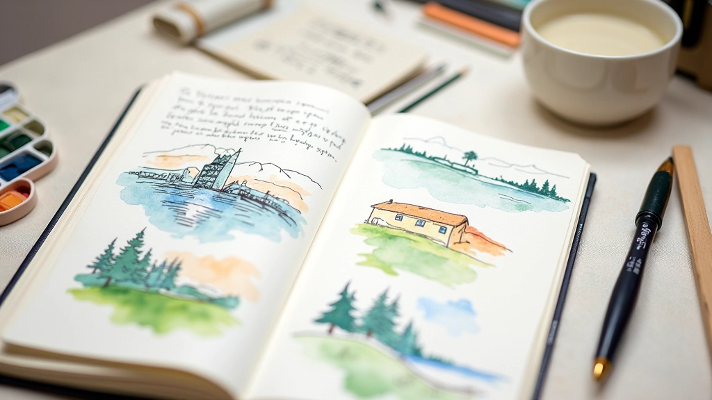
Get a proper sketchbook, something that feels nice to use. You're more likely to draw regularly if you actually enjoy the physical experience. Cheap paper with rough texture discourages shading practice. Decent sketch paper should be smooth enough to take pencil marks clearly.
Don't aim for perfection. Every sketch teaches you something. The "bad" ones where you tried something new are more valuable than perfect repetitions of what you already know.
1
Gather Basic Materials
Quality sketchbook, HB and 2B pencils, eraser, sharpener
2
Start With Line Practice
10 minutes daily drawing different line types and angles
3
Sketch Simple Objects
Draw basic shapes: spheres, cubes, cylinders with shading
4
Move to Real Objects
Draw items around your home, focusing on form and light

Continue Your Art Journey

Ready to Start Sketching?
The best time to begin is now. Grab a pencil, some paper, and give yourself permission to make mistakes. That's where the learning happens.
Explore More Resources