
Watercolor Landscapes: Creating Depth and Atmosphere
Master the techniques that bring your landscapes to life with colour, layering, and atmospheric perspective
Creating a convincing landscape in watercolour doesn't require photorealistic detail. What it does require is understanding how light, colour, and composition work together to pull the viewer into your painting. Whether you're painting misty mountains, sun-drenched valleys, or dramatic seascapes, the fundamental techniques remain the same.
This guide covers the essential methods we've found work best for building atmospheric depth. You'll learn about wet-on-wet application, colour temperature shifts, and layering strategies that create the illusion of distance. We're focusing on practical approaches you can start using in your next painting session.
What You'll Learn
- Wet-on-wet techniques for soft, atmospheric effects
- Colour temperature and how it creates depth
- Layering methods that prevent muddy painting
- Sky and water rendering approaches
- Creating focal points that draw the eye
Understanding Wet-on-Wet Application
The wet-on-wet technique is your foundation for creating soft, atmospheric landscapes. It's not complicated, but it does require understanding how water and pigment interact on damp paper.
Start by preparing your paper. A full soak isn't necessary — you want your paper damp enough that colours flow and blend, but not so wet that it's dripping. Use a clean sponge or spray bottle to dampen the entire surface evenly. This usually takes 30 seconds to 1 minute depending on your paper weight.
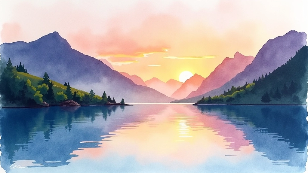
While the paper is wet, drop in your sky colours. They'll spread naturally, creating those soft edges you can't replicate any other way. If you're painting a sunset, you'll apply warm oranges and reds where the sun sits, transitioning to cooler blues above. The colours will blend where they meet, but you're still controlling the overall composition.
Pro tip: Keep your brush fairly dry when working on wet paper. A wet brush on wet paper means you've lost control — the colour spreads everywhere. Your brush should carry colour but not be dripping.


Colour Temperature Creates Distance
This is where your paintings start looking three-dimensional. Warm colours (reds, oranges, yellows) appear to come forward. Cool colours (blues, purples, greens) appear to recede. Use this principle consistently throughout your landscape, and you'll create automatic depth.
In the foreground, use warmer, more saturated versions of your colours. A tree in the foreground might be a rich, warm green with strong contrast. That same tree shape in the middle distance becomes cooler and less saturated. In the background, everything shifts toward cool blue-greys, and the contrast reduces significantly.
This doesn't mean making everything blue in the distance. Rather, it means shifting the undertone of whatever colour you're using. A distant red building becomes a muted mauve. A far-off green hill becomes blue-green. The shift is subtle but powerful.
Key principle: Atmospheric perspective means colours become cooler, lighter, and less saturated as they recede into the distance. Apply this consistently and depth happens automatically.
Building Layers Without Mud
Layering is essential in watercolour landscape painting. You're building from light to dark, from general to specific, from background to foreground. But layering incorrectly creates dull, muddy paintings.
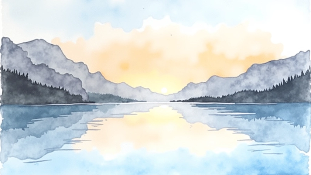
The first layer should be very light — almost barely visible. You're establishing the overall colour scheme and basic composition. Let this dry completely before adding your second layer. This is non-negotiable. Applying wet paint to partially dry paint mixes colours on the paper rather than layering them.
Your second layer adds more definition and slightly deeper tones. You're starting to suggest where mountains or trees are, but they're still soft. The third layer brings stronger definition and richer colour. By the fourth or fifth layer, you're adding fine details and the darkest values, but by then you've built a foundation that prevents muddiness.
Most successful landscapes use between 3-5 layers. More than that and you're overworking it. Fewer and you lack depth. The number isn't as important as the principle — each layer must dry before the next one goes on.
1
Light Wash
Overall pale colour establishing the scene's dominant tone
2
Middle Values
Define shapes and suggest landscape features
3
Dark Accents
Add contrast and focal point details
Skies and Water: Two Critical Elements
Skies are often the most visible part of your landscape, so getting them right matters enormously. Don't paint skies flat blue. Real skies have variation — they're lighter near the horizon, darker overhead. They shift colour depending on the time of day and weather.
Use your wet-on-wet technique here. Apply a very light wash first, then add darker tones while it's still damp. The colours will blend naturally, creating that atmospheric quality that makes viewers feel like they're looking at actual sky.
Water deserves equal attention. Water reflects the sky, but it's also darker than the sky itself. The reflection of a blue sky in water isn't bright blue — it's a muted, slightly darker version. Water also shows directional ripples or waves. These don't need to be detailed — simple curved lines following the water's movement are enough.
Here's a technique that works well: paint the water slightly darker than the sky, then add a few horizontal lines suggesting ripples. Where there's a reflection — say, of a tree or building — the reflection sits directly below the object and extends downward. Make it slightly less defined than the object itself.
Creating a Strong Focal Point
A landscape without a focal point feels aimless. Your viewer's eye doesn't know where to rest. This is where composition comes in. You're not painting everything equally. You're creating a hierarchy.
Your focal point is usually placed off-centre using the rule of thirds. Divide your composition into a 3×3 grid, and position your main interest where the lines intersect. This naturally feels more compelling than something dead-centre.
Make your focal point stand out through contrast. This might be the darkest value in the painting, the brightest colour, the sharpest detail, or the most saturated hue. Everything else supports this — softer edges elsewhere, less detail, more muted tones.
Remember: What you leave out is as important as what you include. Simplify your backgrounds. Suggest rather than describe. This approach not only creates stronger focal points — it also keeps you from overworking your paintings.

Educational Information
This guide presents general watercolour landscape techniques based on established artistic practices. Every artist develops their own approach, and what works brilliantly for one person might need adjustment for another. The methods described here are starting points for exploration, not rigid rules. Your materials, paper quality, water hardness, and personal preferences will all influence your results. Experiment, practice, and develop the techniques that work best for you.
Explore Related Articles